Jun 30, 2012
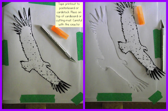
Make Your Own Stencil For Fabric Painting - Condor Shirt

May 21, 2012
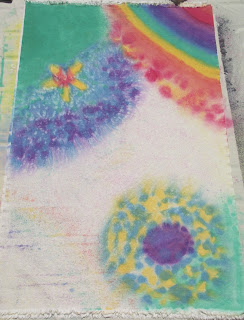
Painting On Raw Canvas - Experimentations

I waited for the top layer to dry - very fast since it was a sweltering hot, sunny day.
Then I flipped the canvas over and and began applying the paint to the back with a big brush, adding water as needed with the brush. This side looks very primary but I will paint over it later and this canvas will become double-sided - I can rotate it on a whim :)
I chose where I put the big washes of colour on the back because I wanted it to bleed through in specific places on the front. For example I wanted the weeds to be greenish.
With this technique, what happens is that the paint on the front blocks colour from bleeding through from the back. The paint from the back only will bleed through onto any remaining parts of canvas that are still raw. It ended up having a far cooler effect than I had expected and I'm really excited about it :-)
One of the parts of this piece that I love most is the way the colour gradation shows through in the three diagonal lines in the corner:
I put my second piece of canvas under the piece I was painting part way through - as soon as I saw what cool effects were bleeding through onto the old sheet. I wanted them on the blank canvas instead!
Would I do anything differently if I did this again?
Yes - first of all I would use more than one finger for holding down the spray nozzle! :-)
I also would leave more areas raw, with only sparse splatter on them, because of how much I love the bleeding through effect.
Mar 26, 2012
Arashi Shibori Style Tshirt Alteration
I use very watered down acrylic paints as a fabric paint rather than fabric dyes and I'm using non-silk fabric so what I'm doing isn't actually Shibori - but that is what has inspired and informed me.
The particular Shibori technique I've been using is called Arashi aka Pole Wrapping. Usually it's done on a diagonal but with this Tshirt, I've done it vertically. I wasn't too careful about making the top of the paint be in an evenly horizontal line which is driving me a bit nuts but I don't notice it much when I wear it so hopefully I will be able to ignore it :)
For those interested in trying this, I didn't even buy any special supplies (eg PVC pipe, sinew or waxed twine).
I covered an old cardboard tube with a plastic bag (so it wouldn't get soggy when it got wet) and used a rubber band to hold each end of the shirt on and used waxed dental floss to wind around. I'm sure twine would be easier on the hands (dental floss is so thin and my fingers were pretty sore afterward) but I like using what I have on hand. When I'm done, I unwrap the floss and wind it onto an old cardboard toilet paper roll to re-use for future Shibori :)
Because the paint was applied by hand to a mostly dry Tshirt, most of the colour stayed on the top exposed layer of the shirt. When using a dye bath or having the shirt very wet first, more of the colour will spread through other layers.
I washed and dried once before wearing. I've had great success using inexpensive acrylic 'craft' paint instead of fabric paint. It does need to be watered down to avoid being stiff or crunchy. I've never used any of the additives you can buy to 'transform' acrylic paint into fabric paint.
This was a plain orange Tshirt and I was hoping for a flame-like effect along the bottom of the shirt:
Check out this great post showing various Shibori techniques: DIY Shibori
Jan 10, 2012
Red Star Mandala
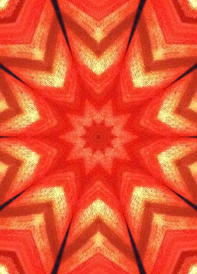
When I want to create but have little energy, I often turn to the free graphics editing program Sumopaint and make mandalas from images I already have on hand.
This mandala was created from a photo of a painting in progress (shown below).
I really love how the texture of the canvas itself shows up in this mandala and makes beautiful, feathery lines.
The painting in progress is small and simple so far. I'm enjoying the colours.
5"x7"
acrylic on canvasboard
Jan 2, 2012
Alien Spires Painting In Progress
I'm finding it really interesting how the way I paint is changed by having images by another person as an underpainting.
At first I thought I wanted to mask areas of his paintings and then have them showing through when my painting was finished... but it didn't look right to me.
You can see some of his original concentric circles showing through in this version. I have already added a coat of paint so the original colours aren't present but the shapes are:

One thing that was really excellent about this experiment was how my choice of colour was influenced by the previous painting. It led me to choose colours and combinations of colours that I wouldn't have normally. I like being stretched like this and I now have a greater appreciation for why some artists sometimes choose a 'pallette' and constrain themselves to it.
There are still changes I plan to make to this painting, areas and colours that I want to change, but for those who enjoy seeing parts of the process, here's how it looks now:
 I'm still a bit frustrated by the way the blue 'tower' on the right appears to lean toward the left (rather than looking like the pink and gold shape is in front of it) but I think I know how to fix that by having a bit of it peek out from the lower left side of that shape.
I'm loving the glowing goldy colours (which are much gentler without the flash glare :)
Followers

This work is licensed under a Creative Commons Attribution-Noncommercial-No Derivative Works 2.5 Canada License.


